Art Direction for Amazon
E-Commerce Content

Enphase Energy is a global leader in home energy solutions, operating in a category where products are complex, high-value, and heavily researched before purchase. I led the art direction and visual system design for their Amazon PDP images and A+ content, with a focus on clarity, hierarchy, and scalable execution across the catalogue.

Project type

Project type

E-Commerce (Amazon PDP & A+)

E-Commerce (Amazon PDP & A+)

E-Commerce (Amazon PDP & A+)

Focus

Focus

Art Direction, Visual System

Art Direction, Visual System

Art Direction, Visual System

Industry

Industry

Energy / Home Electronics

Energy / Home Electronics

Energy / Home Electronics

My Role

My Role

Audit, Creative Direction, Design System Definition, Team Enablement

Audit, Creative Direction, Design System Definition, Team Enablement

Audit, Creative Direction, Design System Definition, Team Enablement

Timeline

Timeline

2 weeks

2 weeks

2 weeks

Challenge

Energy products demand explanation, but on Amazon, attention spans are short and mobile-first.

Enphase’s existing PDP images were:

  • Visually dark and content-heavy

  • Dense with information competing for attention

  • Lacking a clear focal point, especially on mobile

As a result, the primary value propositions were getting lost, and the overall presentation felt harder to scan than it needed to be for a top-selling product.

The challenge was to simplify without oversimplifying - making complex information feel accessible, premium, and trustworthy.

Audit & Strategy

I began with a detailed audit of Enphase’s best-selling product, IQ Powerpack 1500, treating it as the benchmark for the rest of the catalogue.

The audit focused on:

  • Visual hierarchy and content density

  • Mobile readability and skimmability

  • Contrast, lighting, and focus

  • Competitive benchmarks within the category

To support faster research and validation, I used ChatGPT and Perplexity review competitor PDP patterns and category norms. The final insights, prioritization, and recommendations were led and defined by me.

The audit formed the foundation for client onboarding and alignment.

Stack

Design Tools

AI Tools

Stack

Stack

Art Direction & Visual Exploration

Based on the audit findings, I directed two distinct visual routes:

Based on the audit findings, I directed two distinct visual routes:

Based on the audit findings, I directed two distinct visual routes:

Light Theme

  • Cleaner layouts

  • High contrast

  • Minimal visual noise

  • Optimized for fast scanning

Dark Theme

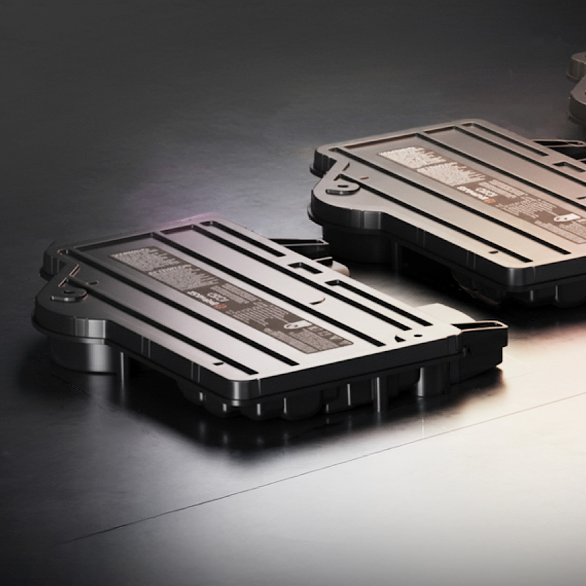
  • Premium, confident visual tone

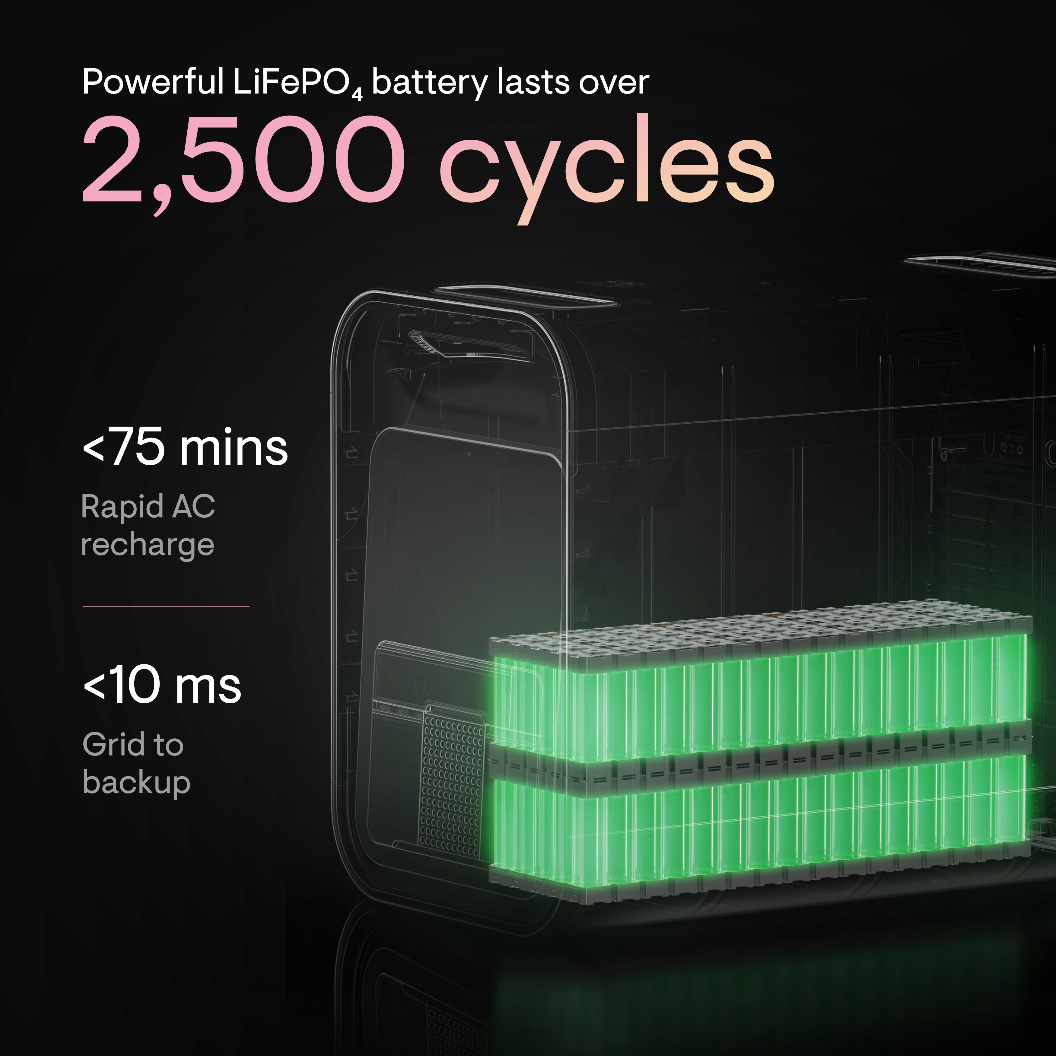
  • Controlled lighting and contrast

  • Reduced clutter while maintaining depth

  • Stronger brand presence

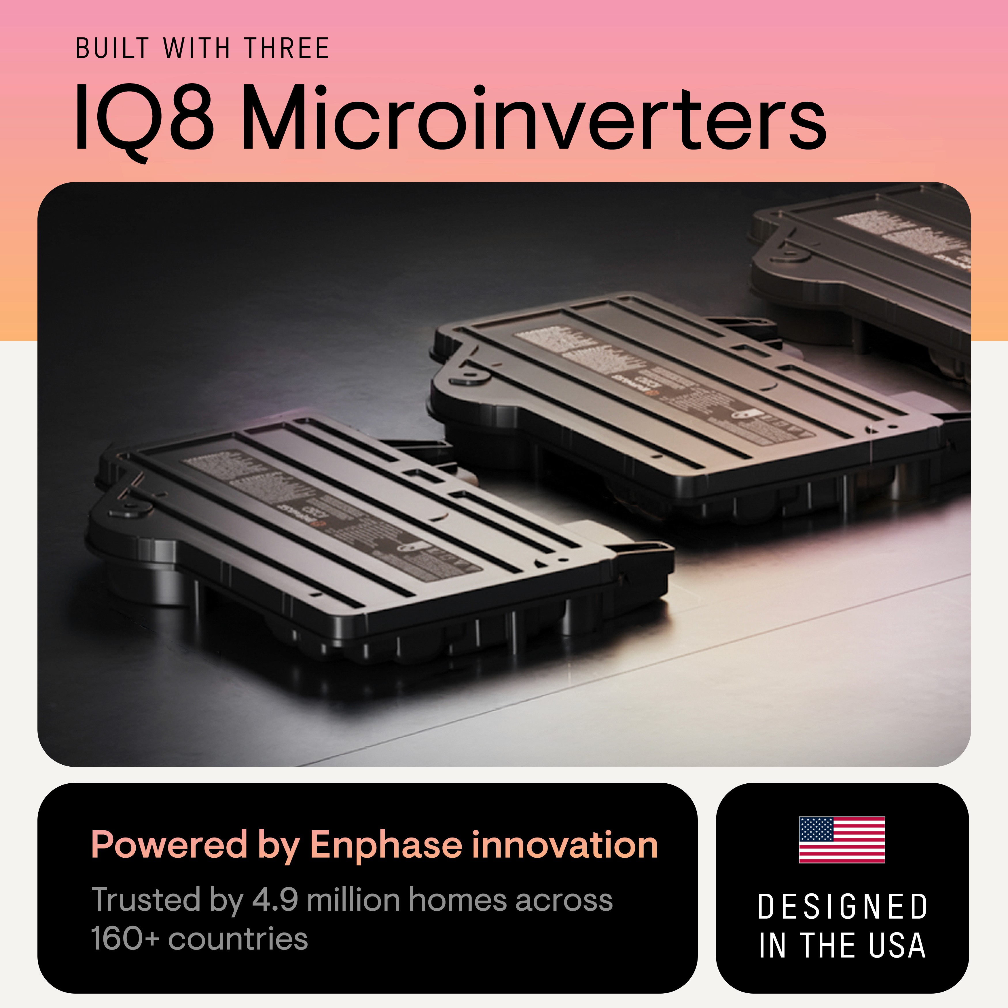
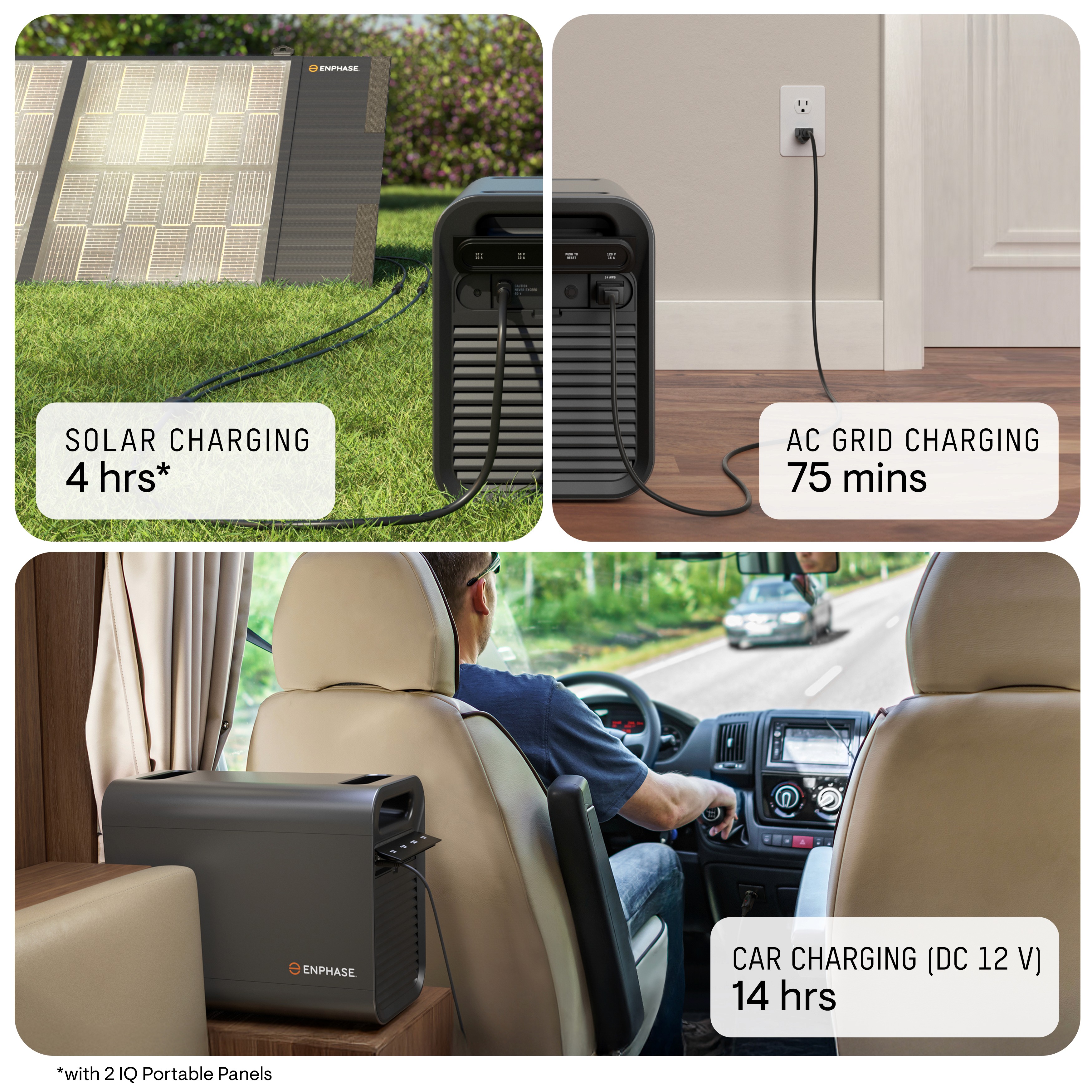
Both directions focused on delivering one clear message per frame, supported by strong focal points and an easy-to-skim visual hierarchy. The layouts were designed with Amazon-first usability in mind, ensuring clarity and effectiveness on mobile where most customer interactions occur.

Both directions focused on delivering one clear message per frame, supported by strong focal points and an easy-to-skim visual hierarchy. The layouts were designed with Amazon-first usability in mind, ensuring clarity and effectiveness on mobile where most customer interactions occur.

Both directions focused on delivering one clear message per frame, supported by strong focal points and an easy-to-skim visual hierarchy. The layouts were designed with Amazon-first usability in mind, ensuring clarity and effectiveness on mobile where most customer interactions occur.

Clarity first
approach

Clarity first
approach

Clarity first
approach

Clear hierarchy to surface the most important message.

Structured storytelling

Structured storytelling

Structured storytelling

Information organized to be easy to scan and understand.

Amazon-first design

Amazon-first design

Amazon-first design

Built for mobile behavior and platform constraints.

Final Direction

After reviewing both options, the client approved the dark theme, as it better aligned with Enphase’s premium positioning while still solving the clarity and focus issues identified in the audit.

This direction became the base visual system.

Execution & Impact

Oversaw the final PDP image set and A+ page rollout on Amazon, ensuring:

  • Clear visual hierarchy and scannable content

  • Strong emphasis on key product benefits

  • Improved consistency across DP and A+ modules

The refreshed creatives enhanced product clarity, strengthened shopper trust, and created a scalable foundation for future catalogue expansion.

Scaling the System

Once the design language was finalized, I documented and shared the guidelines with junior designers who used this system to execute creatives for the remaining products in Enphase’s catalogue - ensuring consistency, speed, and quality at scale.

This allowed the team to move faster without compromising the visual standard.

Outcome

This project reflects my approach as an Art Director:

  • Lead with clarity and structure, not visual noise

  • Balance brand presence with platform realities

  • Build systems, not one-off designs

  • Enable teams to scale work confidently